Free Layout Page |
  
|
Free Layout Page |
|
The Free layout page is a normal page which allows users to define UI Parts on the Page and apply logic through events / actions for managing the content in that area.
At run time, a free layout page handles the rendering of any content in its area and also handles any actions associated with that content. The free layout page provides options to apply some background color for filling its rectangular area. As the application interacts with the user through UI objects, they have a number of responsibilities.
The free layout page can embed other UI objects and create sophisticated visual hierarchies. This creates a parent-child relationship between the pages and objects. A free layout page may contain any number of UI objects.
Create a new Free layout page
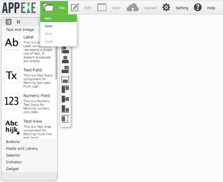
Step 1: Click on "New" from the menu to create a new Page.
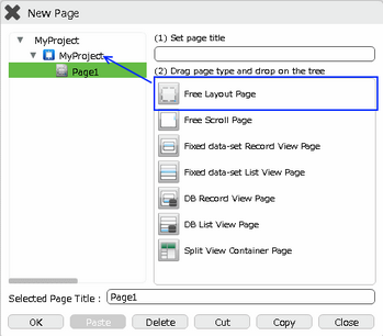
Step 2: Enter name of the page in "Set Page Title" section and select the Free Layout Page.
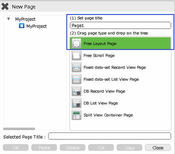
Step 3: Drag and drop it on the "App Title Folder" onto the tree and click OK to open the page.
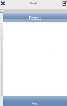
Step 4: Free Layout Page opens as below and its "Properties Palette window" opens as shown in next step.
Step 5: Set up the "Properties Palette window" as required.
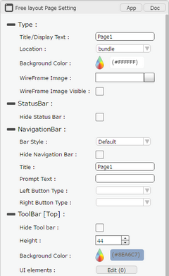
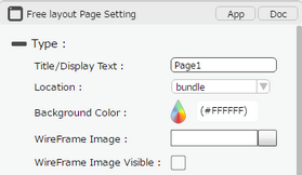
Property |
Description |
Type
App and Doc Buttons opens Page Document Editor. Click here to know more. |
|
Title/Display Text |
Enter the page title. The page title must be unique in the application. |
Location |
Select the page location. Page location defines the location of the page either bundle or remote.
"Bundle": When this option is selected the page being built will reside in the Mobile device, any changes to this page subsequent through AppExe will only take effect in the Mobile application previously installed once it is published, released, submitted, downloaded again and reinstalled/updated by the Mobile App End User. It is best to set this option if the information on this page is most likely not going to change. Eg: Business Contact Information, Business Info/Profile, etc
"Remote": When this option is selected the page being built will reside in the Mobile device but will call the data from the Remote Cloud, any changes to this page subsequent through AppExe will only take effect in the Mobile application previously installed once it is published and released again. The Mobile App End User will have to close the app and re-open it and the changes will appear. It is best to set this option if the information on this page is most likely going to change frequently.E.g: Notice board, Intranets, Event Information, etc.
|
Background Colour |
Select the background color of the page using color picker. It will be white by default. |
Wireframe Image |
Browse to set the Wireframe image on the Page. |
Wireframe Image Visible |
Select this option to make Wireframe Image visible. |
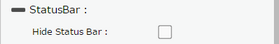
Status Bar
|
|
Hide Status Bar |
Select this option to hide the Status Bar. |
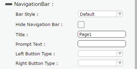
Navigation Bar
|
|
Bar Style |
Set the Navigation Bar style of the page. |
Hide Navigation Bar |
Select this option to hide the Navigation Bar. |
Title |
User can set the Navigation Bar Title as the text desired to be displayed. |
Prompt Text |
User can add a prompt text to the Navigation bar shown on top of the title of the Navigation Bar. |
Left Button Type |
User can set the properties for left button . Click here to know more. |
Right Button Type |
User can set the properties for right button . Click here to know more. |
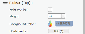
ToolBar(Top)
|
|
Hide ToolBar |
Select this option to hide ToolBar(Top). |
Height |
User can set the Height of the ToolBar. |
Background Color |
User can set Background Color of the ToolBar. |
UI elements |
UI elements can be added in the ToolBar by Clicking on Edit(0) Button. |
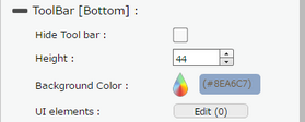
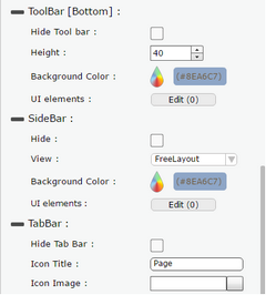
ToolBar(Bottom)
|
|
Hide ToolBar |
Select this option to hide ToolBar(Bottom). |
Height |
User can set the Height of the ToolBar. |
Background Color |
User can set Background Color of the ToolBar. |
UI elements |
UI elements can be added in the ToolBar by Clicking on Edit(0) Button. |
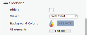
SideBar
|
|
Hide |
Select this option to hide SideBar. |
View |
User can select SideBar View as FreeLayout : This View has fixed height which is the height of the page and fixed width. FreeScroll: This View allows user to set height more than the page height, ScrollBar appears in this view. Table View: This View allows user to create a Record View in the SideBar. |
Background Color |
User can set Background Color of the SideBar. |
UI elements |
UI elements can be added in the SideBar by Clicking on Edit(0) Button. |
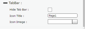
Tab Bar
|
|
Hide tab Bar |
Select this option to hide the Tab Bar |
Icon Title |
User can set Tab Bar icon Title.We strongly recommend user to set the title of maximum 8 characters. |
Icon Image |
User can set some Icon Image which appears at the center of the Tab Bar. Note: 1. Only png image is supported in the Icon Image of Tab Bar Property. 2. iOS can only handle Black and White png images. 3. The icon image should be less than 30X30 pixels. |
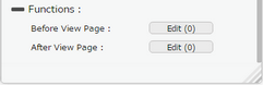
Functions
Functions act as trigger to launch the actions when a particular task is performed. To know more about Functions click here. |
|
Before View Page |
Event is triggered when a page navigation is complete but page is not loaded yet. |
After View Page |
Event is triggered when all UI parts are loaded and page is displayed. |