Text Field |
  
|
Text Field |
|
A Text Field is a UI part that allows the user to display any text inside it, be it numeric or alpha numeric. This text can be edited by clicking on it. Text fields are used to display the text in a single row. To display the text in a multiline view the user could use the Text view UI part.
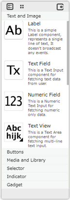
Step 1: To add a Textfield click on the Text and Image tab in the UI toolbox.
Step 2: Drag and drop the Text Field on the page.
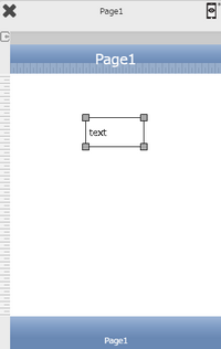
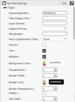
Step 3: When the user drags and drops a TextField on the page, its properties appear automatically on the "Properties Palette window" on the right hand side. User can view the UI part properties by clicking on it's object figure whenever required. User can also edit each property to change the UI part object's figure as shown below.
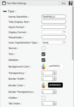
List of Properties:
Property |
Description |
Type
|
|
Name/Identifier |
The Name defines the identity of the Text Field and can be used in the future to refer to it. This should be a unique name and should not be the same as any other UI part in the page being built. |
Title/Display Text |
The Text property allows the user to enter the desired text that the user would like to display on the page within the Text Field. |
Input Format |
Input Format allows user to enter values as per the Input format applied. |
Display Format |
The Display Format Allows to select the format of the text as Date Format for Date value and Number Format for numbers. |
Place Holder |
The place holder property allows the user to enter the short hint that describes the expected value when there is no text in the Text field. |
Auto Capitalization |
Auto Capitalization property changes the text entered into capital letters based on the option selected as "AllCharacters", "Sentences","Words" and "None".
AllCharacters- All the text entered in Display text appears in capital. Sentences- First letter of text entered in Display text will appear in capital. Note: If user enters DOT at the end of the text then the next letter appears in capital. Words-First letter of a word appears in capital. None-Text entered by the user appears as it is, in the display text. |
Secure |
The secure property if checked will convert the text into non readable form like password string. |
Trim |
Trim property if selected allows the user to trim the extra space before the text. |
Editable |
Editable property if selected allows user to Edit the Text Field in Runtime and does not allow to Edit, if not selected. |
Background Color |
The Background color property allows user to set the background color of the UI Part by selecting the desired color from the color picker. |
Transparency |
Transparency property can be used to set the visibility level of the Background color selected. |
Border Width |
Border Width property allows user to set the width of the UI part. |
Border Color |
Border Color property allows user to set the colour of the Border Line. |
Border Transparency |
Border Transparency property allows user to set the visibility level of the Border Line. |
Hidden |
The Hidden property if selected will hide the Text Field UI on different runtimes or platforms. |
Tab Order |
Tab order is a sequence number specified to the UI part. This allows user to select or transfer the control to the UI part as per the sequence number specified, by pressing Tab Button on the keyboard. |
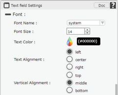
Text Font
|
|
Font Name |
The Font name property allows the user to select the font of the text in the Text Field. |
Font Size |
The Font size property allows the user to set the font size of the text in the Text Field. |
Text Color |
The Text Color property allows the user to change the font color. |
Text Alignment |
The Text Alignment property allows the user to justify the text within the Text Field. Options available are left, right or center. |
Vertical Alignment |
The Vertical Alignment property allows the user to justify the text within the Text Field. Options available are top, middle or bottom. |
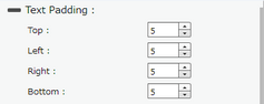
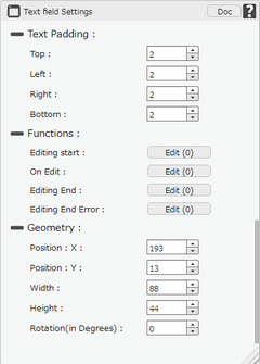
Text Padding
|
|
Top |
Sets the Text Padding from the Top. |
Left |
Sets the Text Padding from the Left. |
Right |
Sets the Text Padding from the Right. |
Bottom |
Sets the Text Padding from the Bottom. |
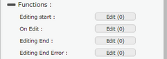
Functions
Functions act as trigger to launch the actions when a particular task is performed. To know more about Functions click here. |
|
Editing Start |
The event will occur when the user will start adding the text in the textfield. |
On Edit |
The event will occur every time when the user will add a word in the textfield. |
Editing End |
The event will occur when the user will stop adding the text in the textfield. |
Editing End Error |
The event will occur when any error occurs after editing ends on textfield. If text entered is not as per the defined input format error occurs. |
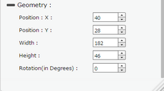
Geomerty
|
|
Position : X |
Sets the position of TextField on the page horizontally.
|
Position : Y |
Sets the position of TextField on the page vertically.
|
Width |
Sets the width of TextField on the page.
|
Height |
Sets the height of TextField on the page.
|
Rotation(in Degrees) |
Rotates the UI Part as per specified Degrees on the page. |
Note: To delete any UI part from the page editor click on the Delete button from keyboard.