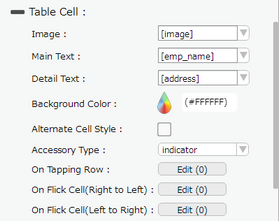
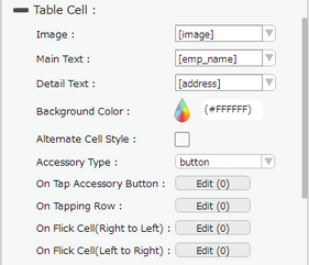
Subtitle cell style allows the user to add an image, Main Text and Detail Text on the cell.


Property |
Description |
Image |
Select the field from the dropdown option which is defined for Image in the database. The image name in the Database should be same as the name of Image file uploaded. To know more about uploading an image Click here. Note: This is an optional field. The main text will be left-aligned if the user doesn’t specify any image. |
Main Text |
Select the database field from the dropdown which user wants to display as the Main text or set the primary data or Main text manually. |
Detail Text |
Select the database field from the dropdown which user wants to display as the Detail text or set the primary data or Detail text manually. |
Background Color |
User can set the background color of the cell. |
Alternate Cell Style |
Alternate Cell Style option allow user to set Background color and images in the alternate cells in List view Page. |
Accessory Type |
Select Accessory Type which is displayed as button on the right side of the cell. The options available are : "Indicator", "Button" or "none". |
On Tap Accessory Button |
On Tap Accessory Button is a function/event attached to the cell that acts as trigger to launch the actions. To know more about Functions Click here. The function/event will occur when the user clicks only on the provided accessory button. |
On Tapping Row |
On Tapping Row is the function/event attached to the cell that will occur when the user clicks anywhere on the cell. |
On Flick Cell (Right to Left) |
On Flick Cell is the function/event attached to the cell that will occur when the user flicks (slight movement of UI on touch) the Cell from Right to Left. |
On Flick Cell (Left to Right) |
On Flick Cell is the function/event attached to the cell that will occur when the user flicks (slight movement of UI on touch) the Cell from Left to Right. |
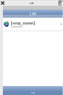
Page Editor View:

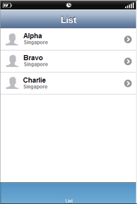
Preview View:
