Contact-Form Cell Style |
  
|
Contact-Form Cell Style |
|
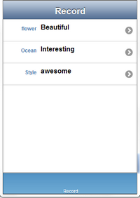
Contact Form cell style allows the user to add Main Text on the left and Detail Text besides the Main text on the cell.
Property |
Description |
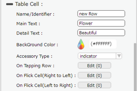
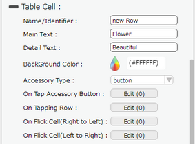
Name/Identifier |
This provides unique identifier of the cell and can be used to set the value in the cell. |
Main Text |
Enter the primary data or Main text to be displayed on the table cell. |
Detail Text |
Enter the subtext or supported detail text, to be displayed on the table cell. |
Background Color |
User can set the background color of the cell. |
Accessory Type |
Select Accessory Type which is displayed as button on the right side of the cell. The options available are : "Indicator", "Button" or "none". |
On Tap Accessory Button |
On Tap Accessory Button is a function/event attached to the cell that acts as trigger to launch the actions. To know more about Functions Click here. The function/event will occur when the user clicks only on the provided accessory button. |
On Tapping Row |
On Tapping Row is the function/event attached to the cell that will occur when the user clicks anywhere on the cell. |
On Flick Cell (Right to Left) |
On Flick Cell is the function/event attached to the cell that will occur when the user flicks (slight movement of UI on touch) the Cell from Right to Left. |
On Flick Cell (Left to Right) |
On Flick Cell is the function/event attached to the cell that will occur when the user flicks (slight movement of UI on touch) the Cell from Left to Right. |
Page Editor View:
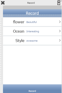
Preview View: