Switch Button |
  
|
Switch Button |
|
A Switch Button is a UI part that allows the user to perform an action associated with switching On and Off options. Switches are used to display a button with default on and off text.
Step 1: To add a Switch Button click on the Buttons tab in the UI toolbox.
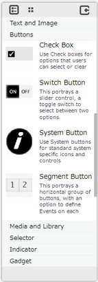
Step 2: Drag and drop the Switch Button on the page.
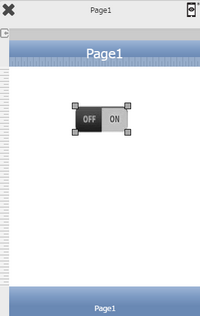
Step 3: When the user drags and drops a Switch Button on the page, its properties appear automatically on the "Properties Palette window" on the right hand side. User can view the UI part properties by clicking on it's object figure whenever required. User can also edit each property to change the UI part object's figure as shown below.
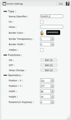 |
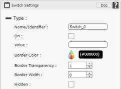
List of Properties:-
Property |
Description |
Type
|
|
Name/Identifier |
The Name defines the identity of the Switch Button and can be used in the future to refer to it. This should be a unique name and should not be the same as any other UI part in the page being built. |
On |
On property if checked will allow the user to initially set the state of the Switch as on. |
Value |
Value field allows the user to fetch the data from any UI part (E.g : textfield) or Database to set the state of Switch. If the values are 1, Yes and True then the state will be ON. Similarly 0, No and False means the state will be OFF. |
Border Color |
Border Color property allows user to set the color of the Border Line. |
Border Transparency |
Border Transparency property allows user to set the visibility level of the Border Line. |
Border Width |
Border Width property allows user to set the width of the UI part. |
Hidden |
The Hidden property if checked will hide the Switch Button UI on different runtimes or platforms. |
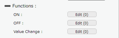
Functions
Functions act as trigger to launch the actions when a particular task is performed. To know more about Functions click here. |
|
ON |
The event will occur when the value of the Switch Button is on. |
OFF |
The event will occur when the value of the Switch Button is off. |
Value Change |
The event will occur when the user changes the value of Switch to either off or on. |
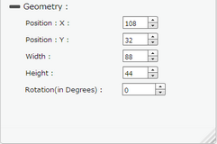
Geometry
|
|
Position : X |
Sets the position of Switch Button on the page horizontally. |
Position : Y |
Sets the position of Switch Button on the page vertically. |
Width |
Sets the width of Switch Button on the page. |
Height |
Sets the height of Switch Button on the page. |
Rotation(in Degrees) |
Rotates the UI Part as per specified Degrees on the page. |