Search Bar |
  
|
Search Bar |
|
Search bar UI part will allow the user to search the information from the DB pages. Database list can be filtered on entering search data in the Search Bar. Click here to see usage.
Step 1: To add the search bar Click on the Text and Image tab in the Ui toolbox.
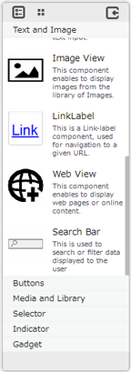
Step 2: Drag and drop the Search bar on the page.
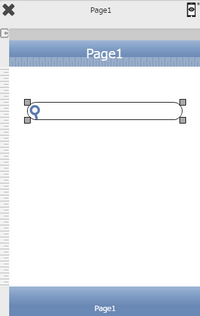
Step 3: When the user drags and drops a Search Bar on the page, its properties appear automatically on the "Properties Palette window" on the right hand side. User can view the UI part properties by clicking on it's object figure whenever required. User can also edit each property to change the UI part object's figure as shown below.
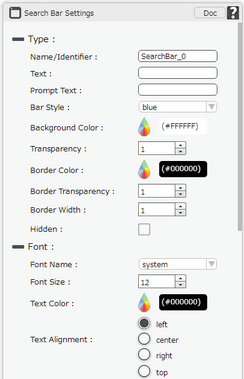
List of Properties:
Property |
Description |
Type
|
|
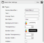
Name/Identifier |
The Name defines the identity of the search bar and can be used in the future to refer to it. This should be a unique name and should not be the same as any other UI part in the page being built.
|
Text |
The Text property allows the user to enter the desired text that the user would like to display on the page within the search bar.
|
Prompt Text |
Enter the prompt to display prompt text above the title, It is not set by default. If Specified, the navigation bar will adjust to display both prompt text and title. |
Bar style |
This defines the design that will be visible on different runtime or platforms. This design is applied on the "search icon" and "cancel icon" of the Search Bar design. The current design options available are Blue, Black , Silver, White. By default Blue bar design is displayed. Click here to know more. |
Background Color |
The Background color property allows user to set the background color of the UI Part by selecting the desired color from the color picker. |
Transparency |
Transparency property can be used to set the visibility level of the Background color selected. |
Border Color |
Border Color property allows user to set the colour of the Border Line. |
Border Transparency |
Border Transparency property allows user to set the visibility level of the Border Line. |
Border Width |
Border Width property allows user to set the width of the UI part. |
Hidden |
The Hidden property if selected will hide the Text Field UI on different runtimes or platforms. |
Font
|
|
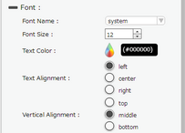
Font Name |
The Font name property allows the user to select the font of the text in the Search bar. |
Font Size |
The Font size property allows the user to change the font size of the text in the Search bar. |
Text Color |
The Text Color property allows the user to change the font color. |
Text Alignment |
The Text Alignment property allows the user to justify the text within the Search bar. Some of the options are left, right or center. |
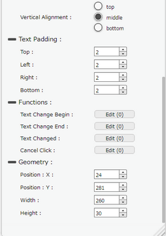
Vertical Alignment |
The Vertical Alignment property allows the user to justify the text within the Search Bar as Top, Middle and Bottom. |
Text Padding
|
|
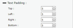
Top |
Sets the Text Padding from the Top. |
Left |
Sets the Text Padding from the Left. |
Right |
Sets the Text Padding from the Right. |
Bottom |
Sets the Text Padding from the Bottom. |
Functions
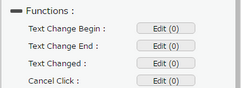
Functions act as trigger to launch the actions when a particular task is performed. To know more about Functions click here. |
|
Text Change Begin |
"Text Change Begin" Will allow user to perform a corresponding action, once the editing starts on the search bar |
Text Change End |
Text Change End' will allow user to perform a corresponding action, once the editing is done on the search bar |
Text Changed |
'Text Changed' will allow user to perform a corresponding action, once the editing is done and focus is moved from the search bar.Click here to know more. |
Cancel Click |
"Cancel Click" will allow user to perform the corresponding action, once the Cancel-Icon located on the right of the SearchBar is clicked. |
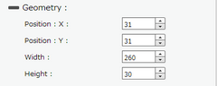
Geomerty
|
|
Position : X |
Sets the position of Search Bar on the page horizontally. |
Position : Y |
Sets the position of Search Bar on the page vertically. |
Width |
Sets the width of Search Bar on the page. |
Height |
Sets the height of Search Bar on the page. |