Indicator |
  
|
Indicator |
|
An indicator is used to show that a task is in progress. User controls an activity indicator by setting the start indicator to set flag using Set Value action. To automatically hide the activity indicator when animstops, set the "hides when stopped" property to YES.
Step 1: To add an Indicator click on the Indicator tab in the UI toolbox.
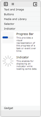
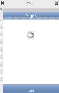
Step 2: Drag and drop an indicator on the page.
Step 3: When the user drags and drops an Indicator on the page, its properties appear automatically on the "Properties Palette window" on the right hand side. User can view the UI part properties by clicking on it's object figure whenever required. User can also edit each property to change the UI part object's figure as shown below.
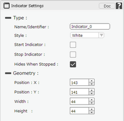
List of Properties:-
Property |
Description |
Type
|
|
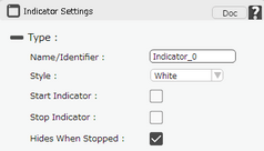
Name/Identifier |
This must be a unique name that will identify the indicator, user may use this name to call the indicator or save information. |
Style |
This is to select the style of the indicator. It can be white or gray. |
Start Indicator |
This is to start the indicator control. If user wants to start the indicator automatically then set it ON. |
Stop Indicator |
If Stop Indicator is selected, the indicator will be in static state. |
Hides When Stopped |
If it is ON then indicator will hide automatically after stopping. |
Geometry
|
|
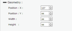
Position : X |
Sets the position of indicator on the page horizontally. |
Position : Y |
Sets the position of indicator on the page vertically. |
Width |
Sets the width of indicator on the page. |
Height |
Sets the height of indicator on the page. |
Note: To delete any UI part from the page editor click on the Delete button from keyboard.
Usage:
1) Drag and Drop a Web View on the Page. Drag and Drop the indicator on the page and place it on top of the Web View UI Part.
2) Set URL for Web View from the Properties Palette window.
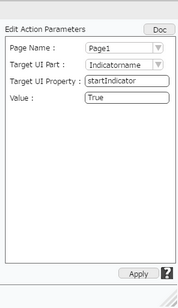
3) Click on Edit(0) Button corresponding to "On Load Start" function of Web View to add action to start indicator. Select "Property Control" actions category ,click on "Set Value".
4) Enter Action Parameters and click apply.
Parameter |
Description |
Target Page |
Select the Target Page. |
Target UI Part |
Select the Target UI Part i.e the Indicator from the Drop down. |
Target UI Property |
Enter the Key to be set here e.g "startIndicator". |
Value |
Enter value as "True". |
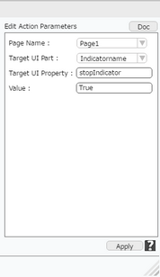
5)Click on Edit(0) Button corresponding to "Finish Load" function of Web View to add action to stop indicator. Select "Property Control" actions category, click on "Set Value".
6)Enter Action Parameters and click apply.
Parameter |
Description |
Target Page |
Select the Target Page. |
Target UI Part |
Select the Target UI Part i.e the Indicator from the Drop down. |
Target UI Property |
Enter the Key to be set here e.g "stopIndicator". |
Value |
Enter value as "True". |
7)Preview the page to see that as the Web View starts getting loaded, the indicator starts and on completion of the loading the indicator stops.