Gadgets |
  
|
Gadgets |
|
A "Gadget" is a unit containing different UI Parts, designed to perform a particular task, which can be used anytime in the Application. A Gadget is used as a UI Part in the Page Editor. Click here to understand gadgets.
Step 1: To add a Gadget click on the Gadgets Tab in the UI toolbox.
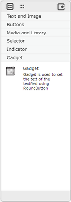
Step 2: Drag and drop the Gadget on the page.
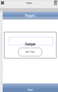
Step 3: When the user drags and drops a Gadget on the page, its properties appear automatically on the "Properties Palette window" on the right hand side. User can view the UI part properties by clicking on it's object figure whenever required. User can also edit each property to change the UI part object's figure as shown below.
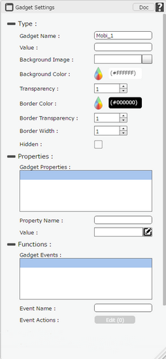
List of Properties:
Property |
Description |
|---|---|
Type
|
|
Gadget Name |
The Name defines the identity of the label and can be used in the future to refer to it. This should be a unique name and should not be the same as any other UI part in the page being built. |
Value |
Value is used as Variable inside the Gadget. |
Background Image |
The Background Image property allows the user to set the desired background image that the user would like to display on the Gadget. |
Background Color |
The Background color property allows user to set the background color of the UI Part by selecting the desired color from the color picker. |
Transparency |
Transparency property can be used to set the visibility level of the Background color selected. |
Border Color |
Border Color property allows user to set the color of the Border Line. |
Border Transparency |
Border Transparency property allows user to set the visibility level of the Border Line. |
Border Width |
Border Width property allows user to set the width of the UI part. |
Hidden |
The Hidden property if selected will hide the Gadget UI on different runtimes or platforms. |
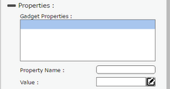
Properties
|
|
Gadget Properties |
Gadget Properties added in Gadget Editor are displayed here. User can override these properties. |
Property Name |
Property Name is the name provided to a property in Gadget Editor for reference in Page Editor. |
Value |
User can override the Value of the Property by clicking on edit icon. |
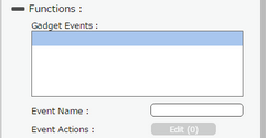
Functions
|
|
Gadget Events |
Gadget Events added in Gadget Editor are displayed here. User can add new action here. |
Event Name |
Event Name is the name provided to an event in Gadget Editor for reference in Page Editor. |
Event Actions |
User can add Action by clicking on Edit(0) button. |
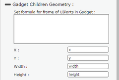
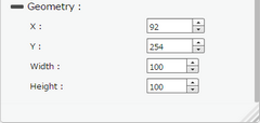
Gadget Children Geometry
|
|
X |
Sets the position of Gadget Children on the page horizontally. |
Y |
Sets the position of Gadget Children on the page vertically. |
Width |
Sets the width of Gadget Children on the page. |
Height |
Sets the height of Gadget Children on the page. |