Combo Box |
  
|
Combo Box |
|
A Combo Box is a UI part that allows the user to select an option from a drop-down list and the selection field displays the current selection. User also performs an action on the basis of selection. It is of two types:
a)Fixed Data
b)Database
Fixed: In the Fixed data option of Combo Box user can define the Items and their data manually.
DB: In DB option of Combo Box user selects data from the database.
Click here to see usage.
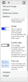
Step1: To add the Combo box. Click on the Selector tab in the UI toolbox.
Step 2: Drag and drop the Combo Box on the page.
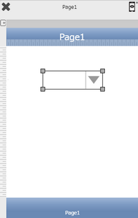
Step3: When the user drags and drops a Combo Box on the page, its properties appear automatically on the "Properties Palette window" on the right hand side. User can view the UI part properties by clicking on it's object figure whenever required. User can also edit each property to change the UI part object's figure as shown below.
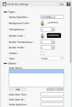
List of Properties:
Property |
Description |
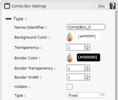
Type
|
|
Name/Identifier |
The Name defines the identity of the Combo Box and can be used in the future to refer to it. This should be a unique name and should not be the same as any other UI part in the application being built. |
Background Colour |
The Background Color property allows user to set the background color of the UI Part by selecting the desired color from the color picker. |
Transparency |
Transparency property can be used to set the visibility level of the Background color selected. |
Border Color |
Border Color property allows user to set the colour of the Border Line. |
Border Transparency |
Border Transparency property allows user to set the visibility level of the Border Line. |
Border Width |
Border Width property allows user to set the width of the UI part. |
Hidden |
The Hidden property if checked will hide the Combo Box UI on different runtimes or platforms. |
Type |
Provides option to select from Fixed and DB Data. |
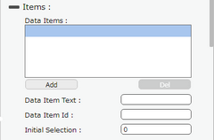
Items (Fixed)
|
|
Data Items |
Data Items displays list of Data Items,which can be added by clicking on "Add" and removed by clicking on "Del" buttons provided below as shown in the Image. |
Data Item Text |
Text for the data item to be displayed. |
Data Item ID |
Unique ID of the Data Item. |
Initial Selection |
The index selected here displays the corresponding Data Item Text in the ComBo Box by default at runtime on different platforms. |
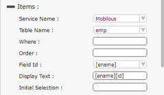
Items (DB Data)
|
|
Service Name |
User must select one of the Service Name from the drop down menu. If the user is using the Local Database, The user can use "Local DB" or "Mobilous" as the service name. |
Table Name |
User must select the table name from the drop down. See Database Manager help page for more detail. |
Where |
User can also specify the where condition to filter the records. The syntax of where condition is like "Fieldname='value'" which is a SQLite3's where syntax. where Field Name: Name of the database table field. Value: Data from the table record. For Example: id='7' |
Order |
User can set the Order of the Data displayed as Ascending or Descending. |
Field Id |
Field Id is the Field Name selected to be displayed in the Combo Box. |
Display Text |
Display Text can be used to show multiple fields in the Combo Box For e.g "[ename] [id]" will show data of both the fields. |
Initial Selection |
The index selected here displays the corresponding Data Item Text in the ComBo Box by default at runtime on different platforms. |
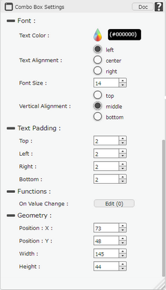
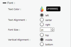
Font
|
|
Text Color |
The Text Color property allows the user to change the font color. |
Text Alignment |
The Text Alignment property allows the user to justify the text within the Combo Box. Some of the options are left, right or center. |
Font Size |
The Font size property allows the user to change the font size of the text in the Combo Box. |
Vertical Alignment |
The Vertical Alignment property allows the user to justify the text within the Combo Box as Top, Middle and Bottom. |
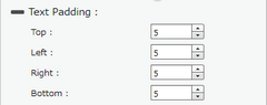
Text Padding
|
|
Top |
Sets the Text Padding from the Top. |
Left |
Sets the Text Padding from the Left. |
Right |
Sets the Text Padding from the Right. |
Bottom |
Sets the Text Padding from the Bottom. |
Functions
|
|
On Value Change |
It defines that , On change of value by selecting some Fixed data item or any DB item inside Combo Box some action needs to be performed. Click here to know more. |
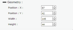
Geometry
|
|
Position : X |
Sets the position of Combo Box on the page horizontally. |
Position : Y |
Sets the position of Combo Box on the page vertically. |
Width |
Sets the width of Combo Box on the page. |
Height |
Sets the height of Combo Box on the page. |