Segment Button |
  
|
Segment Button |
|
A Segment is a horizontal control made of multiple buttons, each button act as a discrete button. A segment can display a title or an image.
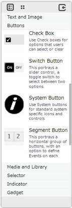
Step 1: To add a Segment Button click on the Buttons tab in the UI toolbox.
Step 2: Drag and drop the segment on the page.

Step 3: When the user drags and drops a Segment Button on the page, its properties appear automatically on the "Properties Palette window" on the right hand side. User can view the UI part properties by clicking on it's object figure whenever required. User can also edit each property to change the UI part object's figure as shown below.
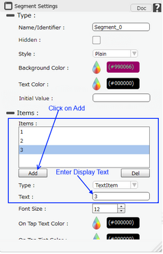
List of Properties:-
Property |
Description |
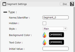
Type
|
|
Name/Identifier |
This must be a unique name that will identify the Segment, user may use this name to call the Segment or save information. |
Hidden |
The Hidden property if checked will hide the Segment Button UI on different runtimes or platforms. |
Style |
It gives a drop down list to select from "Plain","Bezeled". |
Background Color |
Allows user to set Background color of the segment. |
Text Color |
Allows user to set the text color. |
Initial value |
User can set Initial value in the Segment Button as "Text" from Items section below. The option entered is displays the button initially selected. |
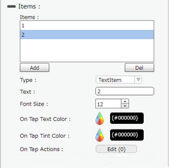
Items
|
|
Items |
Displays the list of Segment buttons."Add" button allows user to add segment button,"Del" button allows to delete the segment button. |
Type |
Type property allows user to select TextItem or ImageItem. |
Text |
Allows user to enter the text of the Segment Button. |
Font Size |
Allows user to set the font size of the Segment Button text. |
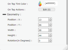
On Tap Text Color |
Allows user to set the Text Color when the Segment Button is tapped. |
On Tap Tint Color |
Allows user to set the Tint Color when the Segment Button is tapped. |
Image File |
Image File option is visible when the "Type" selected is "ImageItem". It Allows user to select the image to be displayed on the Segment button. |
On Tap Actions |
The event will occur when the user taps the button. |
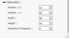
Geometry
|
|
Position : X |
Sets the position of Segment Button on the page horizontally. |
Position : Y |
Sets the position of Segment Button on the page vertically. |
Width |
Sets the width of Segment Button on the page. |
Height |
Sets the height of Segment Button on the page. |
Rotation(in Degrees) |
Rotates the UI Part as per specified Degrees on the page. |
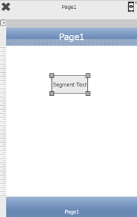
Page after setting Property:
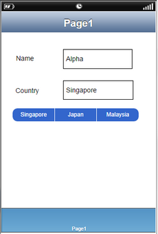
Segment Button usage example:
Please Note:
For Android: Image Name should be a-z 0-9, eg alpha1.png.
Other Image Names like
a)icon.png (default android icon filename)
b)Upper case on filename and ext. name. eg ALPHA. PNG
c)Numeric filename e.g 123.png
d)Other characters aside from a-b 0-9 like @lph!.png
e)CJK (Chinese, Japanese and Korean) characters
are not supported.