Round Button |
  
|
Round Button |
|
A Round button is a UI part that allows the user to perform an action associated with it. Round buttons are used to display a button with text in it.
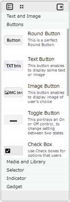
Step 1: To add a Round Button click on the Buttons tab in the UI toolbox.
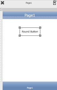
Step 2: Drag and drop the Round button on the page.
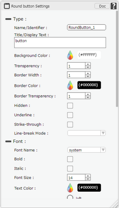
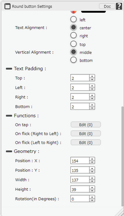
Step 3: When the user drags and drops a Round Button on the page, its properties appear automatically on the "Properties Palette window" on the right hand side. User can view the UI part properties by clicking on it's object figure whenever required. User can also edit each property to change the UI part object's figure as shown below.
List of Properties:
Property |
Description |
|
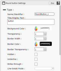
Type
|
||
Name/Identifier |
The Name defines the identity of the Round Button and can be used in the future to refer to it. This should be a unique name and should not be the same as any other UI part in the page being built. |
|
Title/Display Text |
The Title/Display Text property allows the user to enter the desired text that the user would like to display on the Round Button on the page. |
|
Background Color |
The Background Color property allows user to set the background color of the UI Part by selecting the desired color from the color picker. |
|
Transparency |
Transparency property can be used to set the visibility level of the Background color selected. |
|
Border Width |
Border Width property allows user to set the width of the UI part. |
|
Border Color |
Border Color property allows user to set the color of the Border Line. |
|
Border Transparency |
|
|
Hidden |
The Hidden property if checked will hide the Round Button UI on different runtimes or platforms. |
|
Underline |
Underline property if selected displays the text with an underline. |
|
Strike - through |
Strike - through property if selected displays the text with a line across the text. |
|
Line Break Mode |
User can select "Word Wrap" as Line Break Mode where the text gets wrapped up depending upon size of UI Part. |
|
Font
|
||
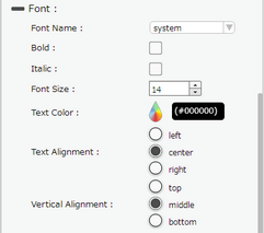
Font Name |
The Font name property allows the user to select the font of the text of the Round Button. |
|
Bold |
The Bold property allows the user to set the Round Button text as Bold. |
|
Italic |
The Italic property allows the user to set the Round Button text as Italic. |
|
Font Size |
The Font size property allows the user to change the font size of the text in the Round Button. |
|
Text Color |
The Text Color property allows the user to change the font color. |
|
Text Alignment |
The Alignment property allows the user to justify the text within the Round Button. Some of the options are left, right or center. |
|
Vertical Alignment |
The Vertical Alignment property allows the user to justify the text within the Round Button as Top, Middle and Bottom. |
|
Text Padding
|
||
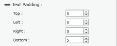
Top |
Sets the Text Padding from the Top. |
|
Left |
Sets the Text Padding from the Left. |
|
Right |
Sets the Text Padding from the Right. |
|
Bottom |
Sets the Text Padding from the Bottom. |
|
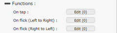
Functions
Functions act as trigger to launch the actions when a particular task is performed. To know more about Functions click here. |
||
On Tap |
The event will occur when the user taps the button. |
|
On flick (Left to Right) |
The event will occur when the user flicks (slight movement of UI on touch) the button from Left to Right direction. |
|
On flick (Right to Left) |
The event will occur when the user flicks (slight movement of UI on touch) the button from Right to Left direction. |
|
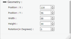
Geometry
|
||
Position : X |
Sets the position of Round Button on the page horizontally.
|
|
Position : Y |
Sets the position of Round Button on the page vertically.
|
|
Width |
Sets the width of Round Button on the page. |
|
Height |
Sets the height of Round Button on the page.
|
|
Rotation(In Degrees) |
Rotates the UI Part as per specified Degrees on the page. |
|