Picker |
  
|
Picker |
|
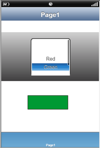
The Picker is used to select a particular item from list of items. It consists of component displayed in the form of a wheel having columns and rows of items at indexed locations.
The items on each row is either a string value or an image object. User can select particular item and its value by selecting or scrolling the component through mouse selection.
Step 1: To add a Picker click on the Selector tab in the UI toolbox.
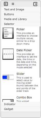
Step 2: Drag and drop the Picker on the page.
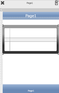
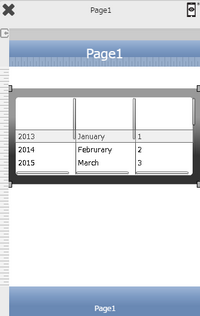
Step 3: When the user drags and drops a Picker on the page, its properties appear automatically on the "Properties Palette window" on the right hand side. User can view the UI part properties by clicking on it's object figure whenever required. User can also edit each property to change the UI part object's figure as shown below.
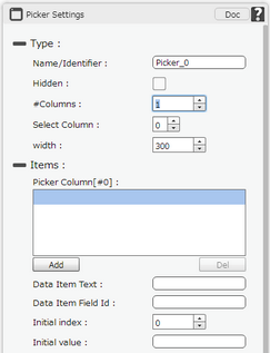
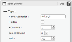
List of Properties:-
Property |
Description |
Type
|
|
Name |
This must be a unique name that will identify the picker, user may use this name to call the Picker or save information. |
Hidden |
The Hidden property if checked will hide the Picker UI on different runtimes or platforms. |
# columns |
The number of column in the picker. The default number is 1. |
Select Column |
Select Columns property shows the index of the columns created and allows user to select the columns by selecting the respective index. |
Width |
Allows user to set the width of the column. |
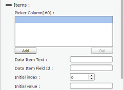
Items
|
|
Picker Column[#0] |
Picker Column property allows user to add items to the column by clicking on "Add" button and deleting the item by "Del" button. |
Data Item Text |
Text value to be displayed for the data item. |
Data Item Field ID |
Unique ID value of the Data item. |
Initial Index |
User can select the initial or default numerical value for the picker item which user wants to be initially selected. |
Initial Value |
Initial value field allows user to enter a database field e.g [fieldname] and the data in that field will be initially selected in the picker. e.g [year] is the field name and its value in database is "2016", then in the picker "2016" will be selected initially. |
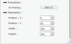
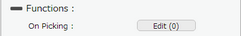
Functions
Functions act as trigger to launch the actions when a particular task is performed. To know more about functions click here. |
|
On Picking |
Event will occur when user changes the value of Picker. |
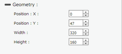
Geometry
|
|
Position : X |
Sets the position of Picker on the page horizontally. |
Position : Y |
Sets the position of Picker on the page vertically. |
Width |
Sets the width of Picker on the page. |
Height |
Sets the height of Picker on the page. Please note the height of Picker can only be 162, 180 or 216. |
Usage:
1) Drag and Drop Picker and TextView to the Page. Set Property details for Picker and TextView UI Part.
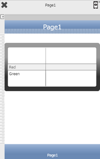
2) Add items to the Picker.
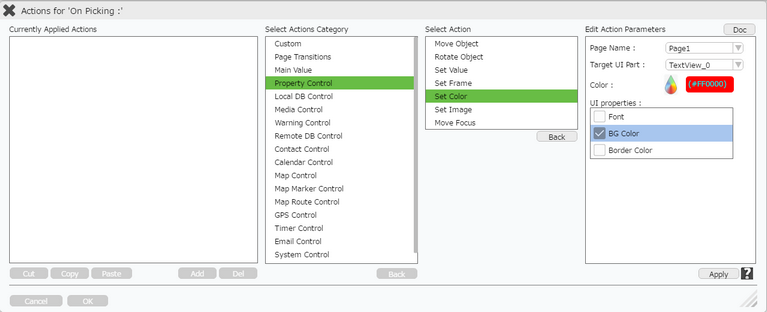
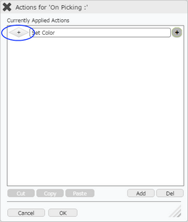
3) Click on Edit(0) on "On Picking" function. Click on "Add" to add action. Select "Property Control" action category and click on "Set Color" action. Click Apply.
Enter Action Parameters.
Parameter |
Description |
Target Page |
Select the Target Page e.g "Page1". |
Target UI Part |
Select the Target UI Part i.e the "TextView_0" from the Drop down. |
Color |
Set the Color from the Color Picker. |
UI properties |
Select BG Color. |
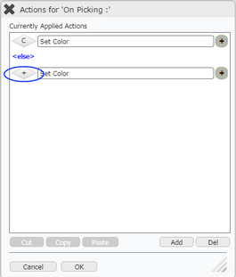
4) Click on Condition "+" button on the left of the action in the first image below.
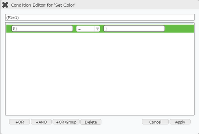
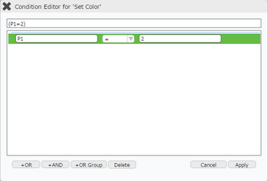
Enter values in the condition Box as shown in the second image below.
Parameter |
Description |
Target |
Select the Target i.e Picker name "P1". |
Operator |
Select operator from Drop Down "=". |
Value |
Enter the Value as "1" . |
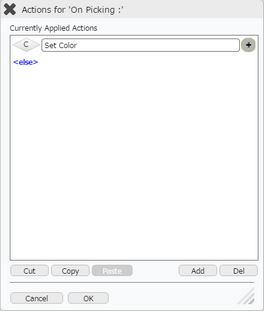
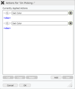
5) Condition is applied as shown below. Click on "Add" button at the bottom to apply action for next color.
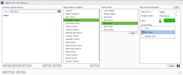
6) Select "Property Control" action category and click on "Set Color" action. Click Apply.
Enter Action Parameters.
Parameter |
Description |
Target Page |
Select the Target Page e.g "Page1". |
Target UI Part |
Select the Target UI Part i.e the "TextView_0" from the Drop down. |
Color |
Set the Color from the Color PIcker. |
UI properties |
Select BG Color. |
7) Click on Condition "+" button on the left of the action applied, in the first image below.
Enter values in the condition Box as shown in the second image below.
Parameter |
Description |
Target |
Select the Target i.e Picker name "P1". |
Operator |
Select operator from Drop Down "=". |
Value |
Enter the Value as "2" . |
6) Condition is applied as shown below.
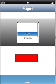
7) Preview the Page. Click on the color as the color of the TextView changes.