An Image is a UI part that allows the user to display a static image in an application. This image can be a logo, background image etc.
Image View can be Dragged from one position to another on Runtimes.
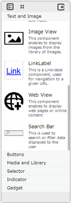
Step 1: To add an image click on the Text and Image tab in the UI toolbox.

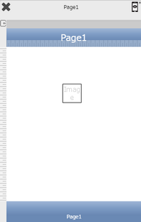
Step 2: Drag and drop the image on the page.

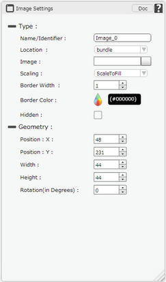
Step 3: When the user drags and drops a Image View on the page, its properties appear automatically on the "Properties Palette window" on the right hand side. User can view the UI part properties by clicking on it's object figure whenever required. User can also edit each property to change the UI part object's figure as shown below.

Please Note:
For Android: Image Name should be a-z 0-9, eg alpha1.png.
Other Image Names like
a)icon.png (default android icon filename)
b)Upper case on filename and ext. name. eg ALPHA. PNG
c)Numeric filename e.g 123.png
d)Other characters aside from a-b 0-9 like @lph!.png
e)CJK (Chinese, Japanese and Korean) characters
are not supported.
List of Properties:-
Property |
Description |
Type
|
|
Name/Identifier |
The Name/Identifier defines the identity of the Image and can be used in the future to refer to it. This should be a unique name and should not be the same as any other UI part in the page being built. |
Location |
Location specifies the location of the image as
Gallery- The image is located in the Gallery of the device. remotefile- The Image file is located in Remote Server url- URL option is used for picking image from some url. bundle- Bundle is selected if the image is on local machine. local- The Image file is located in Local DB. signature- The file is saved in form of Signature of the user in Remote Server |
Image |
The image property allows the user to upload and set the desired image that the user would like to display on the page. |
Scaling |
Scaling property allows user to select any of the following option: AspectFit: The image is scaled within the image view UI but maintaining the Aspect ratio. Some part of the Image UI Part is not covered. ScaleToFill: The image is scaled within the image view UI part fully. It covers the whole area of the Image UI Part |
Border Width |
Border Width Property allows user to set the width of the Image border. |
Border Color |
Border Color property allows user to set the colour of the border. |
Hidden |
The Hidden property if checked will hide the ImageView UI on different runtimes or platforms. |
Geometry
|
|
Position : X |
Sets the position of image on the page horizontally.
|
Position : Y |
Sets the position of image on the page vertically.
|
Width |
Sets the width of image on the page.
|
Height |
Sets the height of image on the page.
|
Rotation (in Degrees) |
Rotates the UI Part as per specified Degrees on the page. |
Note: To delete any UI part from the page editor click on the Delete button from keyboard.