Cell Style |
  
|
Cell Style |
|
It defines the style of the cell. It can be of the following types:
Style |
Definition |
|
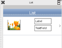
Custom |
In this style user can add the desired UI parts which may include text as well as Image component as per the requirement.
If user checks the flexible height on, then it will automatically adjust the height of the cell. |
|
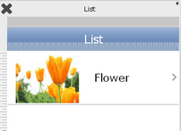
Default |
In this style only main text is displayed at the center in the list form. User has an option to display the images as per the requirement.
|
|
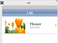
Subtitle |
In this style the main text is displayed at the center along with the sub title text just below it. |
|
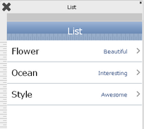
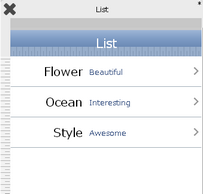
Right aligned |
In this the main text will be on the left where as the Detail text will be right aligned. |
|
Contact Form |
In this style the main text and detail text is displayed in the form of contacts list. |
|
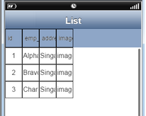
Simple Grid |
In this style the data is displayed in tabular form. |
|
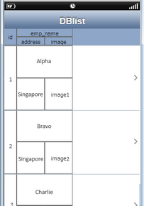
Tabular Grid |
In this style the data is displayed in tabular form having rows and columns of different sizes. |
|